When I plan to remodel my house, I sometimes imagine a kitchen as the first space I want to fix. It seems to be a place where housewives do the most housework and want to realize various romances, so they are especially interested in it. So today, I looked for a pretty house with a very modern and stylish kitchen interior and a minimal interior without patterns. This is an apartment that I would like to refer to very much in that it is not a typical sink interior.
First, I’ll tell you the general structure. This house is about 18 pyeong and has a simple structure with a living room and kitchen common area, bedroom space and bathroom. It has a tower-shaped feel, and the living room is narrow, and it is characterized by a part connected to the kitchen. It is a space with a central column wall and very high ceiling height. Due to the characteristics of this structure, minimal interiors can maximize the advantages, so it is also noteworthy that the number of furniture is limited and colors such as sink color and sofa color are limited to achromatic colors.

From the bedroom, you can see the living room and kitchen at a glance. Even if the ceiling is very high and the floor area is not large, it shows a room with a sense of openness. And with minimal interior design that eliminates decorative elements as much as possible, the living room and kitchen have a more neat and modern atmosphere.

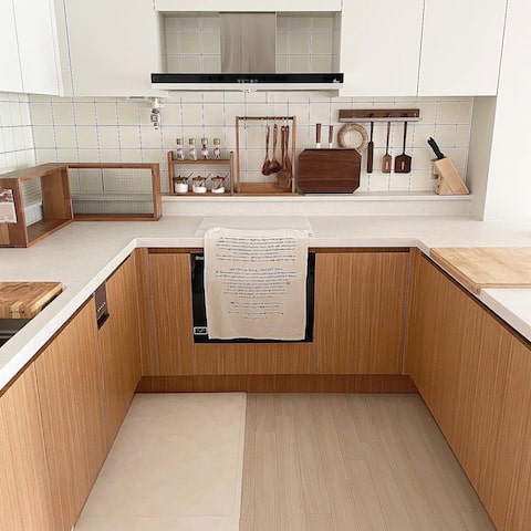
Then, let’s take a look at the kitchen interior with a very high-quality sink color. The sink interior is also very simple, so it would be good to design and construct the sink that you can see directly from the living room. First of all, in the kitchen composition, the IH cooker and built-in home appliances can be stored on the back, which is constructed as a shelf. It is a sink interior that allows you to open and close the door with a pocket door without the upper length.

You can compare the utilization of the rear pocket door. The color of the sink is also two-tone, and dark brown and light wood are perfectly matched. Above all, I like the fact that the kitchen life and home appliances that I can see from the living room are neatly organized by installing pocket doors. The Irish kitchen interior is made narrow, so it can be used as a table using bar chairs. If the kitchen interior is small, please note that it is very practical to add a table function to the Irish sink interior.

The top panel is made of artificial marble at a reasonable price, and the combination of black and wood makes the kitchen look modern.Oh, the color of the sink is made of wood film paper in two colors. The pale wood texture creates a more luxurious atmosphere than a single color. The line lighting also goes well with dark colors. It is a combination kitchen with a very good view of the minimal interior.The acrylic construction on the Irish side to make the small living room and kitchen a little more expandable leaves the atmosphere less heavy, leaving a moderate degree of sophistication, making it a perfect reference for kitchen interiors.Let’s take a look at other aspects of the living room. Wall-mounted televisions were installed on the pillars. The windows and crevices also featured wood shelves, highlighting decorative elements. This space is also necessary for minimal interiors, so if you want to store books or put small items or objects, it is recommended to balance them.Next, let’s look at the bedroom space. The bedroom had a huge sliding door inner door with black frame on molar glass. It’s an element that makes a bedroom like a hotel, and it’s an important element that makes a small house not stuffy while creating a very nice space.All doors are not in the gate, and the line is clean.The gate line is to be constructed as a hidden door, such as hidden door, as hidden door, as a hidden door.If you like mini-Mell interior, I think there are many ways to hear the university of the gate line.If you do this, it is certainly good and easy to see the wall body is easy and easy.Isn’t it a bedroom with a huge molar glass inner gate that shows off its wonderful appearance is? It is a bedroom with magnetic lighting and black lines from the frame. The dark colors of the kitchen interior are connected together, so it’s good to see the whole house look unified The more you look at the gate-free door, the simpler it is like a wall.It’s a clean house with a neat overall atmosphere, so the minimal interior shows well. In fact, in summer, I become interested in this kind of distracting and neat home renovation. It is a very simple house with little living and no small furniture, accessories or flower pots, so it has the effect of visually looking very cool in summer.Now, let’s take a look at the entrance. The entrance is also constructed with an open hidden door. It is constructed to match the wooden floor with the wall of Yongtongwood. The color of the sink is connected along the wall, so the house naturally looks unified.It also had a wider effect by installing a full-body mirror. Such sophisticated construction has gathered together to complete a cleaner house. Like this, today I showed you a very modern minimal interior from the color of the kitchen interior sink to the composition of the sofa and the bedroom. If you want a house with space available for the increasingly hot summer, it would be perfect as a reference.behavior
![[정보]COMPASS GROUPESS 고르곤마을 [정보]COMPASS GROUPESS 고르곤마을](https://changwonri.kr/wp-content/plugins/contextual-related-posts/default.png)
